[ Safety analytics & risk trends ]
Safety analytics that show where to act first.
Bring safety events, driver behaviour and operational context together to focus action where it matters most.

WHERE PATTERNS EMERGE
Look at Safety Risk From Four Angles.
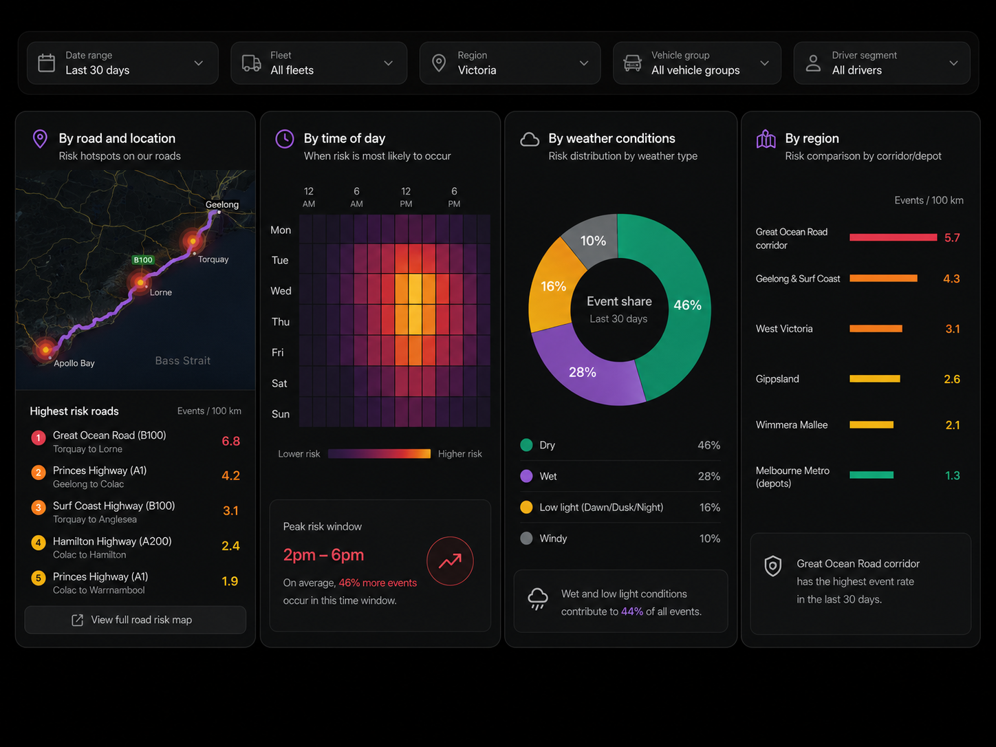
By road and location
See confirmed events by road, volume or rate, with the highest risk roads ranked by events per thousand kilometres and shown as map hotspots.
By time of day
See events by day and hour, with rates per thousand kilometres making recurring time based patterns visible.
By weather conditions
Compare confirmed events across dry, wet, rain and other conditions to see where risk changes.
By region
Compare events per thousand kilometres across regions, giving every depot the same basis for comparison.
FROM INSIGHT TO ACTION
Turn What You See into What You Do Next
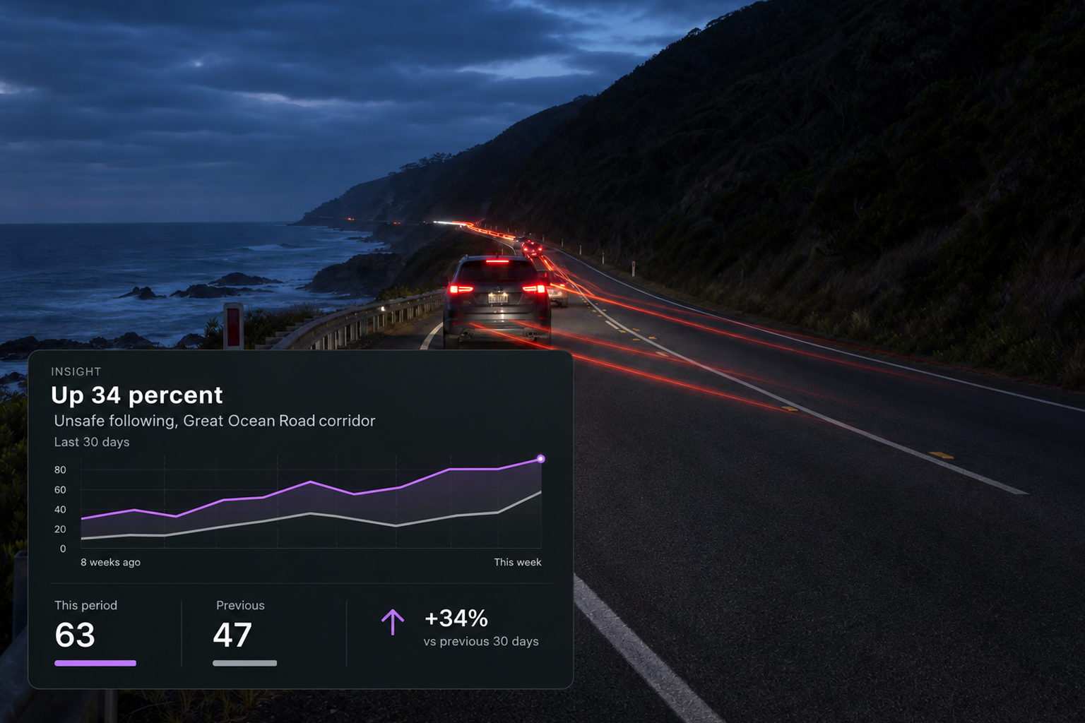
The Insight
See the measured change against a previous period, with the trend and affected locations shown alongside it.
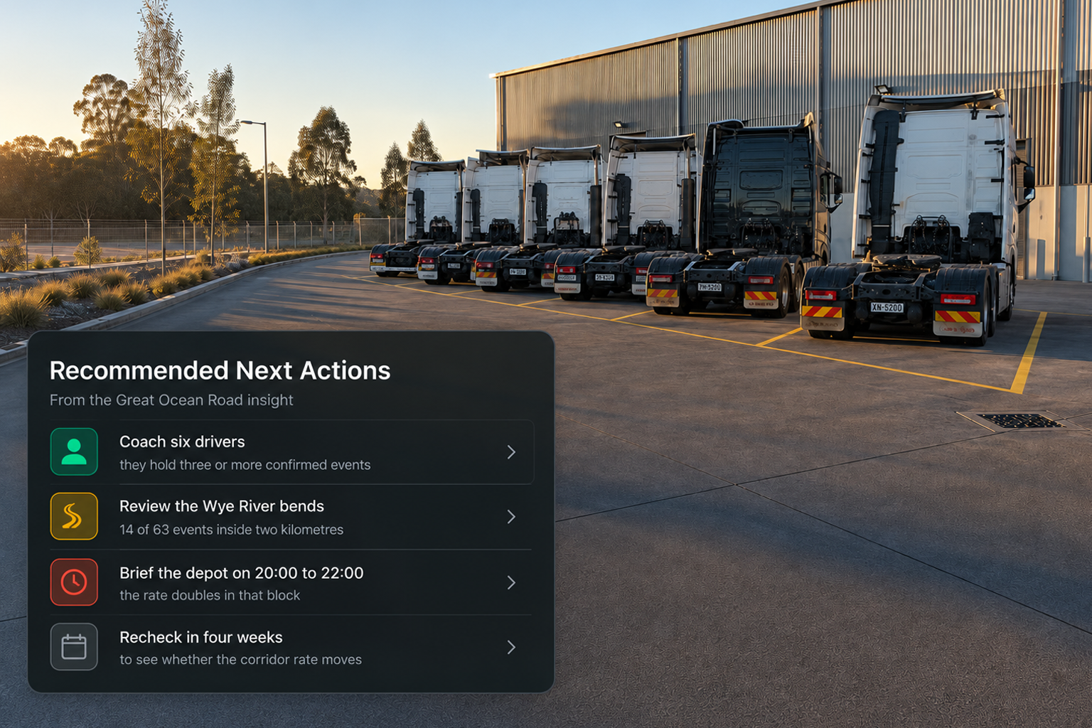
Recommended Next Actions
Review affected routes, notify the safety manager, create a coaching group for the behaviour or save the view to track how it changes.
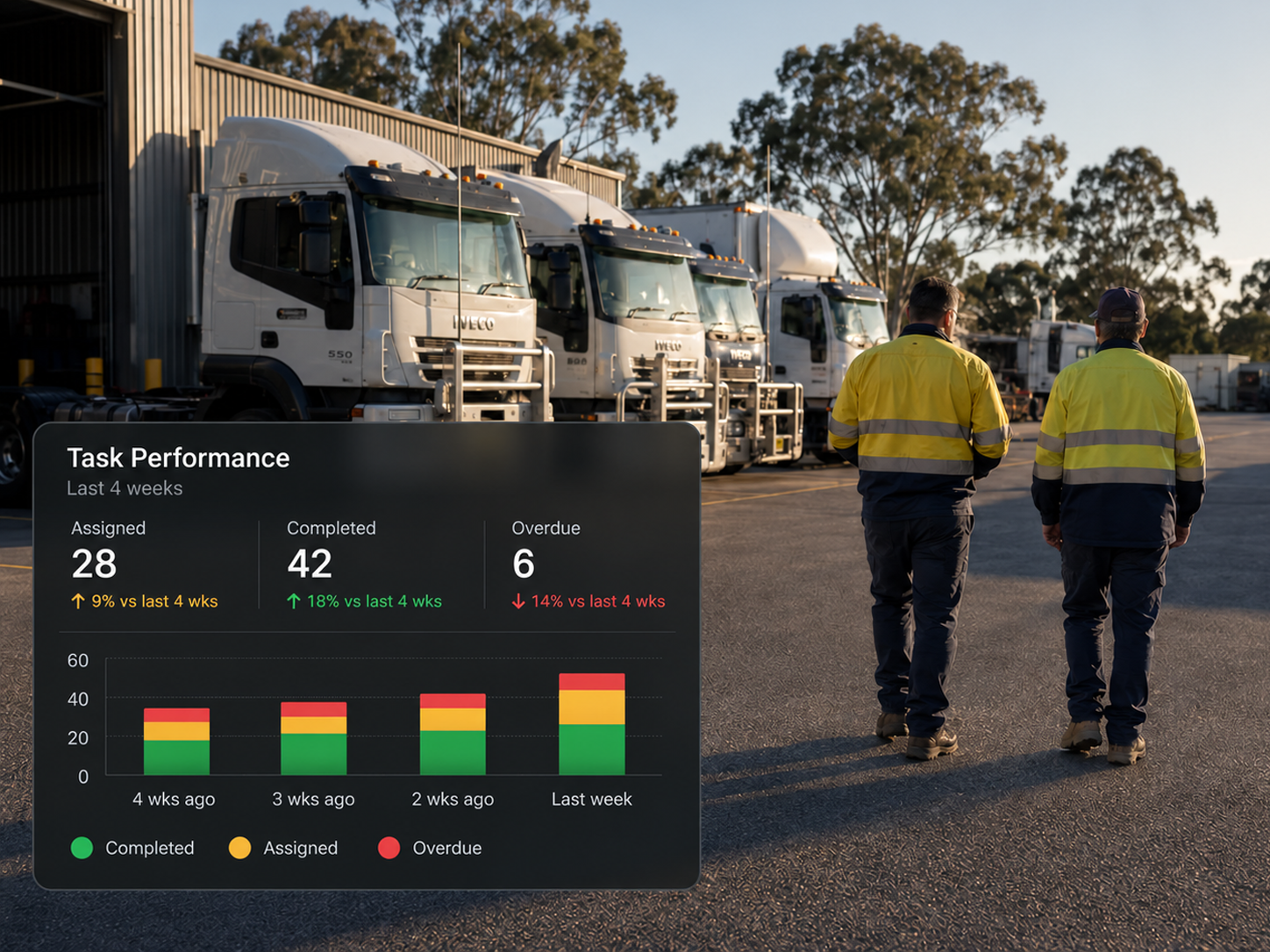
See Whether the Action Made a Difference
Coaching activity and completion
Track assigned, completed and overdue coaching over time, so performance is measured by what was completed, not just what was raised.
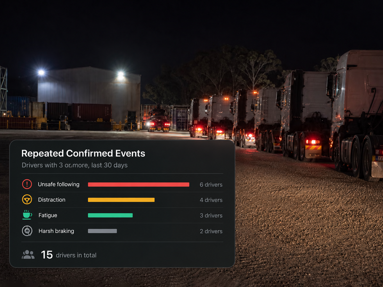
Drivers with repeated events
Rank drivers by event type to focus effort on the behaviours and people where intervention is most needed.
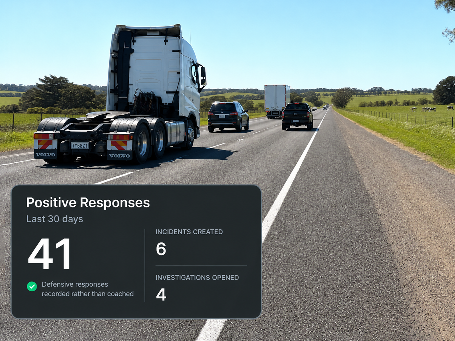
Positive driver responses
Track the share of support in cab alerts followed by a positive change, alongside incidents created and investigations opened.
Additional features
Confirmed Events Only
Base metrics on confirmed events unless stated otherwise.
Events Per 1,000 km
Compare fleets of different sizes using a common rate.
Metric Definitions
See how each measure is calculated wherever it appears.
Period Comparison
Compare any selected period with the one immediately before it.
Risk Indicator
See an overall risk score broken down by severity.
Pending Review
See events still waiting for a human decision.
Fleet and Region Filters
Focus the analysis on the operation or region you need.
Vehicle and Driver Groups
Compare like with like across defined groups.
By Rate or By Volume
View the same road data by frequency or total events.
Saved Views
Save a view and return to it as the data changes.
Share an Insight
Send a finding directly to the person responsible for action.
Data Freshness
See when the underlying data was last refreshed.
See the Pattern. Take Action. Measure What Changes.

The pattern
The same corridor, the same hour, every week

The action
Targeted coaching where it’s needed
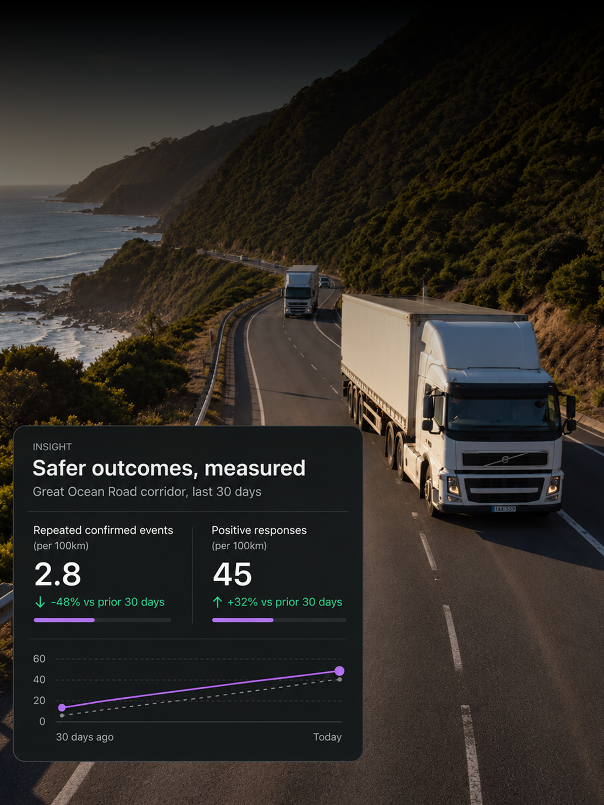
The outcome
See what changed and by how much
What counts towards these numbers?
Confirmed events, unless a metric states otherwise. Events are reviewed and confirmed, dismissed or reclassified first, so analytics are based on decisions rather than raw detections.
Why events per thousand kilometres rather than a count?
Raw event counts can be difficult to compare when fleets, regions or driver groups cover different distances. Events per thousand kilometres normalises the measure by distance travelled, providing a more consistent basis for comparison.
Can I see why a number moved?
Yes. Each insight shows its trend against the previous period and where it is occurring, with supporting views by road, time of day, weather and region.
How do we know coaching is working?
Track coaching as assigned, completed and overdue, rank repeated events by type and driver and measure positive responses to in cab alerts alongside incidents and investigations.
Where are the metrics defined?
Definitions appear alongside the metrics in the product, so everyone reading the same figure has the same understanding of what it means.
Can insights be shared?
Yes. Send an insight to a safety manager, turn it into a coaching group or save it as a view to monitor over time.
Find the Patterns Behind the Risk
Identify recurring behaviours, link them to focused actions and track what happens next.